豹哥小密圈看到的一个题,动手实现了一下
css的一些奇淫技巧,会让一个需求的实现方案出现多种。
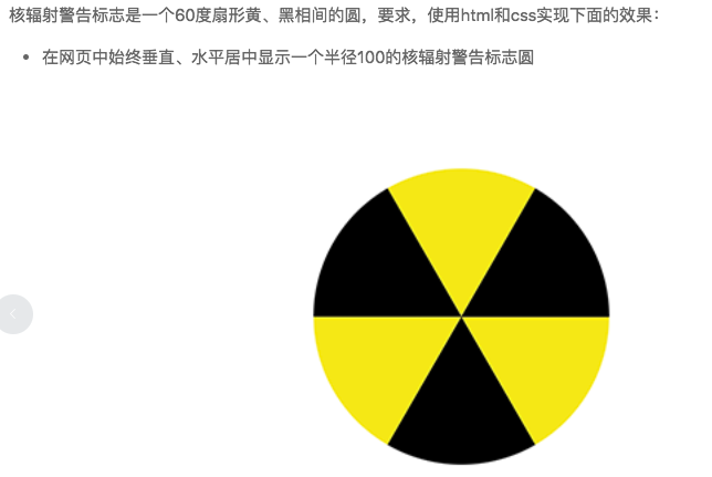
如题:
基本思路
将扇形拆分成三角,整个圆是6等分,即每个圆角60°,扇形所对应是一个等边三角形,利用overflow:hidden,将等边三角形裁剪成
扇形,实现了一个扇形,那其他的几个进行旋转。
我们肯定知道利用css的border来实现三角形,那么如何实现一个等边三角形呢?
基础栗子:
1
2
3
4
5
6
7
| .triangle {
width: 0;
height: 0;
border-width: 10px 10px 10px 10px;
border-style: solid;
border-color: #ff0000 transparent transparent transparent;
}
|
这样会生成一个等腰直角三角形,顶角90°,显然不满足需求,但是我们也已经实现了一半,通过改变border-width,以达到60°脚。
结合三角函数,以及border生成三角形,我们把等边三角形从顶角等分,分成两个30°顶角的直角三角形,三角形短边就是我们所设置的
border-width(具体怎么算,尝试一下就知道了)。那么如题,需求是半径100px,即我们60°所对应的直角边就是100px,所以我们的border-width
就是r*cos(30°),这样我们的等边三角形就出来了(因为cos(30°)所得到的只能是一个近似值,所以这样做出来的肯定是有误差的)。
方案一
画出一个等边三角形,复制6个,然后每个一次多旋转60°,最后凑成原型。
1
2
3
4
5
6
7
8
| <div class="circle-box1">
<div class="item nth-0"></div>
<div class="item nth-1"></div>
<div class="item nth-2"></div>
<div class="item nth-3"></div>
<div class="item nth-4"></div>
<div class="item nth-5"></div>
</div>
|
1
2
3
4
5
6
7
8
9
10
11
12
13
14
15
16
17
18
19
20
21
22
23
24
25
26
27
28
29
30
31
| $r: 100px;
$sin60: 0.866;
$borwid: $r / $sin60 / 2;
.circle-box1 {
width: 200px;
height: 200px;
margin: 50px auto;
position: relative;
border-radius: 100%;
overflow: hidden;
background: #ff0000;
.item {
width: 0;
height: 0;
border-width: $r $borwid 0 $borwid;
border-style: solid;
border-color: #ff0 transparent transparent transparent;
position: absolute;
left: $r - $borwid;
top: 0;
transform-origin: 50% 100%;
&:nth-child(2n + 1) {
border-color: #333 transparent transparent transparent;
}
@for $i from 0 through 5 {
&.nth-#{$i} {
transform: rotate(60deg * $i)
}
}
}
}
|
方案二
方案一的优化版,在上述的例子中,如果四边都不是透明的话,我们可以形成四个等腰直角三角形,所以现在改成两个对角的等边三角形。
1
2
3
4
| <div class="circle-box2">
<div class='circle'>
</div>
</div>
|
1
2
3
4
5
6
7
8
9
10
11
12
13
14
15
16
17
18
19
20
21
22
23
24
25
26
27
28
29
30
31
32
33
34
35
36
37
38
39
40
41
42
43
44
45
46
47
48
| $r: 100px;
$sin60: 0.866;
$borwid: $r / $sin60 / 2;
.circle-box2 {
width: 200px;
height: 200px;
text-align: center;
margin: 50px auto;
border-radius: 100%;
overflow: hidden;
background: #ff0000;
.circle {
display: inline-block;
width: 0;
height: 0;
border-width: $r $borwid $r $borwid;
border-style: solid;
border-color: #333 transparent #ff0 transparent;
position: relative;
box-sizing: border-box;
&:before {
content: '';
display: block;
width: 0;
height: 0;
border-width: $r $borwid $r $borwid;
border-style: solid;
border-color: #ff0 transparent #333 transparent;
position: absolute;
left: -$borwid;
top: -$r;
transform: rotate(60deg)
}
&:after {
content: '';
display: block;
width: 0;
height: 0;
border-width: $r $borwid $r $borwid;
border-style: solid;
border-color: #ff0 transparent #333 transparent;
position: absolute;
left: -$borwid;
top: -$r;
transform: rotate(-60deg)
}
}
}
|
方案三
方案三借鉴圈友发的大漠的一个例子。与原方案不相同的是,这个扇形是通过将圆形进行遮罩而实现的,再通过clip进行裁剪。
1
2
3
4
| <div class="circle-box3">
<div class="circle"></div>
<div class="circle turn"></div>
</div>
|
1
2
3
4
5
6
7
8
9
10
11
12
13
14
15
16
17
18
19
20
21
22
23
24
25
26
27
28
29
30
31
32
33
34
35
36
37
38
39
40
41
42
43
44
45
46
47
48
49
50
51
52
| .circle-box3 {
width: 200px;
height: 200px;
margin: 50px auto;
position: relative;
background: #ff0000;
border-radius: 100%;
overflow: hidden;
.circle {
width: 200px;
height: 200px;
position: absolute;
left: 0;
top: 0;
border-radius: 100%;
overflow: hidden;
clip: rect(0, $r * 2, $r, 0);
&.turn {
transform: rotateX(180deg);
&:before {
background-image: linear-gradient(60deg, #333 50%, #ff0 0);
}
&:after {
background-color: #333;
}
}
&:before{
content: '';
display: block;
width: 100%;
height: 100%;
background: #ff0;
background-image: linear-gradient(60deg, #ff0 50%, #333 0);
position: absolute;
left: 0;
top: 0;
}
&:after {
content: '';
display: block;
width: 100%;
margin-left: 50%;
height: 100%;
background-color: #ff0;
transform-origin: left;
transform: rotate(30deg);
position: absolute;
left: 0;
top: 0;
}
}
}
|
里面有几个需要注意的点:
css transform-origin 定义旋转的中心点
clip rect(top, right, bottom, left),其中需要注意的是right和bottom,这里面的值都是基于左上角来算的。
css 线性渐变 linear-gradient
css transform: rotate() 基于某轴的旋转
总结
在实现之前其实已经想到,也就是上面的那个近似值问题,在渲染的时候,也包括计算的时候,方案一二形成的三角形的60°只能说近似60°,
导致的结果是扇形之间是有间隙的,所以上面的代码中,在包围盒设置了红色背景,为了突出间隙,可通过将背景色设置的与扇形颜色一样解决该问题。
方案三种的实现,可能远离上麻烦一点,但是这里画出来的60°角可以认为是基本准确的。从html结构来说,也相对较好。
css的世界里面,有着各种技巧,所以方案应该也不止这三种。奈何博主本人技能有限,欢迎大神给出更好的方案。